Balance in design
2 min read
BY
Phillips Rea

Balance in design is rarely about perfect symmetry. For a modern creative agency, true visual harmony comes from the deliberate distribution of weight, contrast, and space.
When you look at a highly refined layout, the eye doesn't want to rest in the dead center; it wants to be guided. Asymmetrical balance achieves this by pitting heavy visual elements—like bold, oversized typography—against breathing room and staggered imagery. It creates a dynamic tension on the screen.
Mastering Whitespace
Whitespace is never just empty space; it is the structural foundation of a minimalist interface. By stripping away distracting borders, unnecessary text, and heavy containers, the design allows the actual work to take center stage.
Visual Weight and Contrast
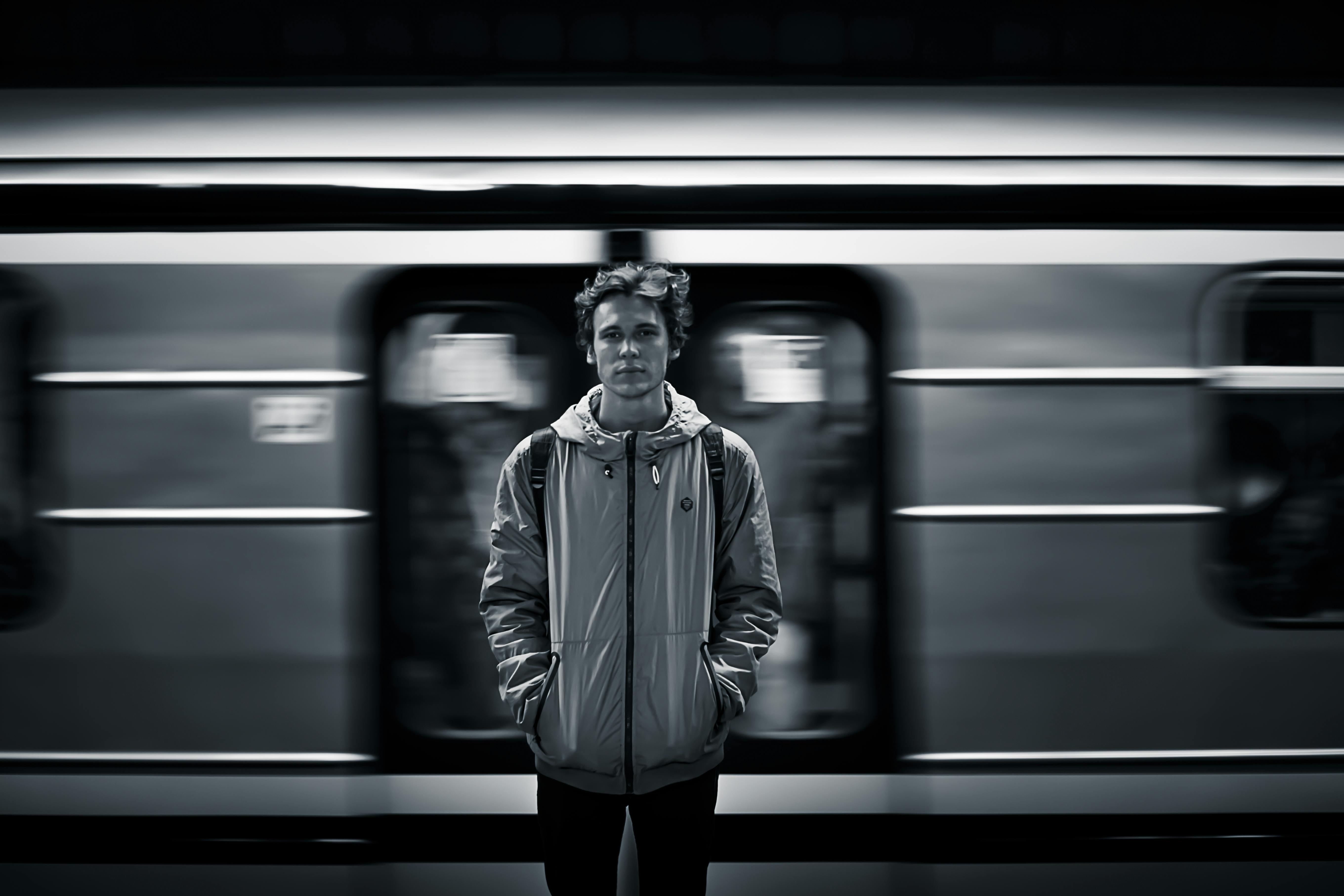
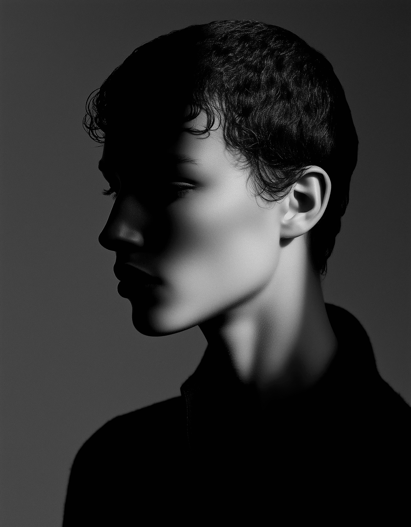
A high-contrast approach pairing stark typography with deep, moody imagery requires careful pacing. A large heading on the left can be perfectly balanced by a smaller, but visually dense, image placed lower on the right. This staggered pacing mirrors an editorial magazine layout, keeping the user engaged as they scroll and explore.
Design isn't about filling the canvas. It’s about knowing exactly what to leave out, ensuring every element that remains serves a distinct, powerful purpose.